Alkami Mobile Experience
Reimagined the entire mobile banking experience for a Flutter-powered iOS and Android app — from navigation architecture to interaction patterns — and turned it into the company's north star for mobile strategy.
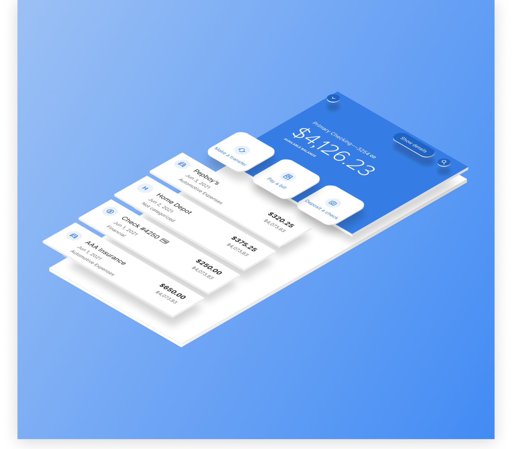
Overview
Alkami's mobile banking app hadn't seen a meaningful design evolution since 2015. By 2019, clients were saying it out loud: the experience felt dated. Competitors were rolling out polished, fully native apps and sales was feeling the pressure in every deal.
I was given the opportunity to explore what the next generation mobile experience could look like — a visual designer's dream assignment. What started as a few explorations became a proof of concept, then a mobile design system, and eventually the foundation for a second-generation system covering both mobile and desktop. The final concept became the company's official north star for mobile strategy.
The Challenge
The legacy experience had problems beyond aesthetics. The navigation was a drawer of 100+ configurable widgets — fine when the platform was young, unusable at scale. Clients couldn't manage their own navigation structures without filing a support request. And since the app wasn't Flutter-powered yet, modern interaction patterns (swipe actions, long press, pinch-to-expand) weren't available.
The specific problems to solve:
- More branding surface area for clients — the legacy experience was visually flat
- Deeper integration for promotional content in menus and landing views
- Modern touch interactions: swiping, long press, pinch/pull
- Extensible, self-serve navigation that scaled with the product catalog
- A visual aesthetic clients could customize and brand as their own
- Unified design language across iOS, Android, and mobile web
Complicating all of this: design cycles were slow and brittle. Evangelizing a completely new approach required bringing stakeholders along — engineering leads, product owners, and ultimately clients — before a single line of code was committed.
Success Metrics
From the start, we grounded the work in measurable outcomes rather than just shipping something that looked better. The target bar:
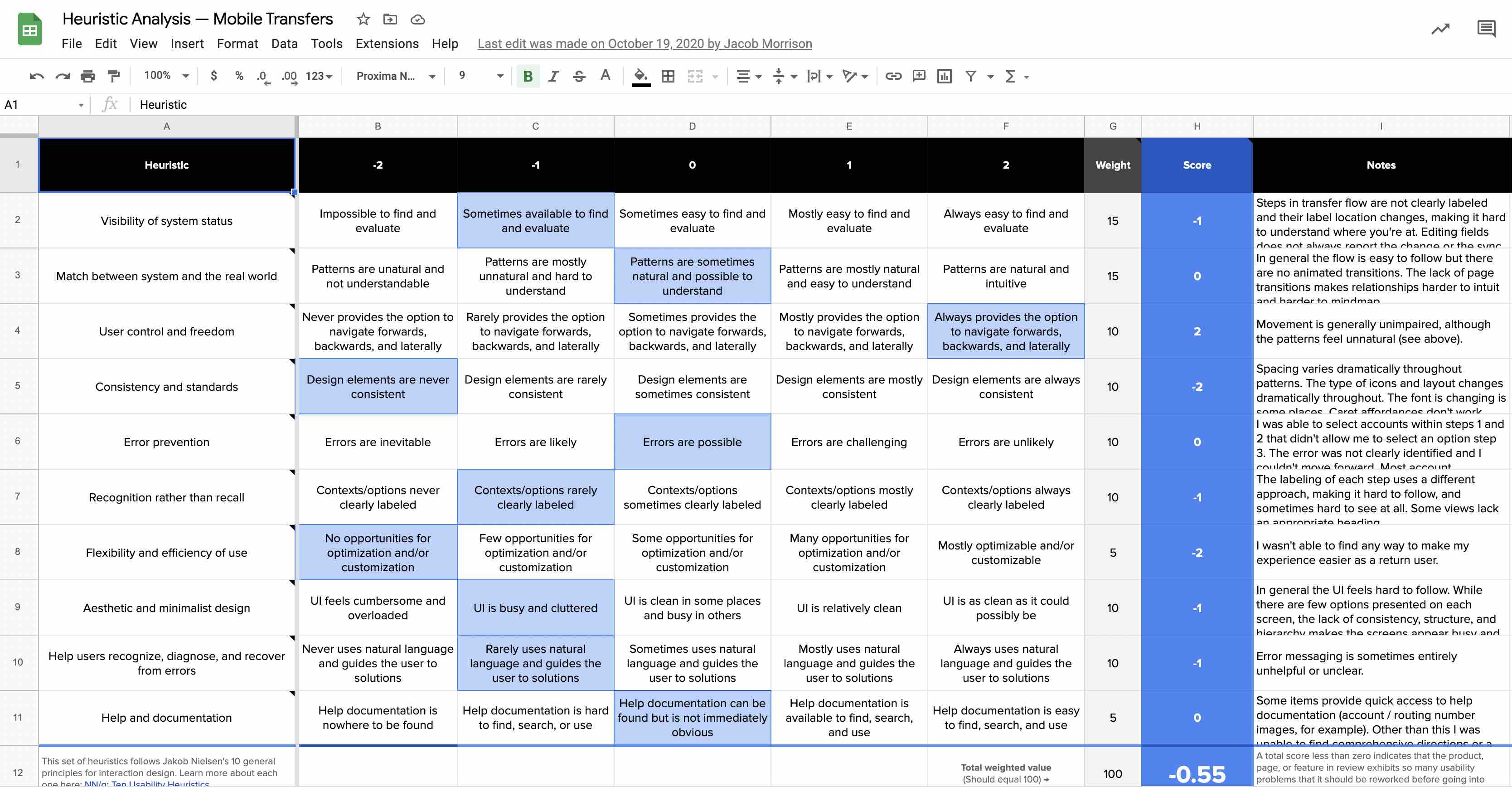
- Usability Heuristic score ≥ 1.0
- System Usability Scale (SUS) score ≥ 95
- Major task discovery within 2 taps
- Multiple routes to every key task
- Use only already-coded components (no new engineering debt)
- Unified design language across channels
Having these defined up front meant we could baseline the legacy experience and run the new designs against the same rubric. No gut-feel debate about whether it was better — we could show it.
Explorations
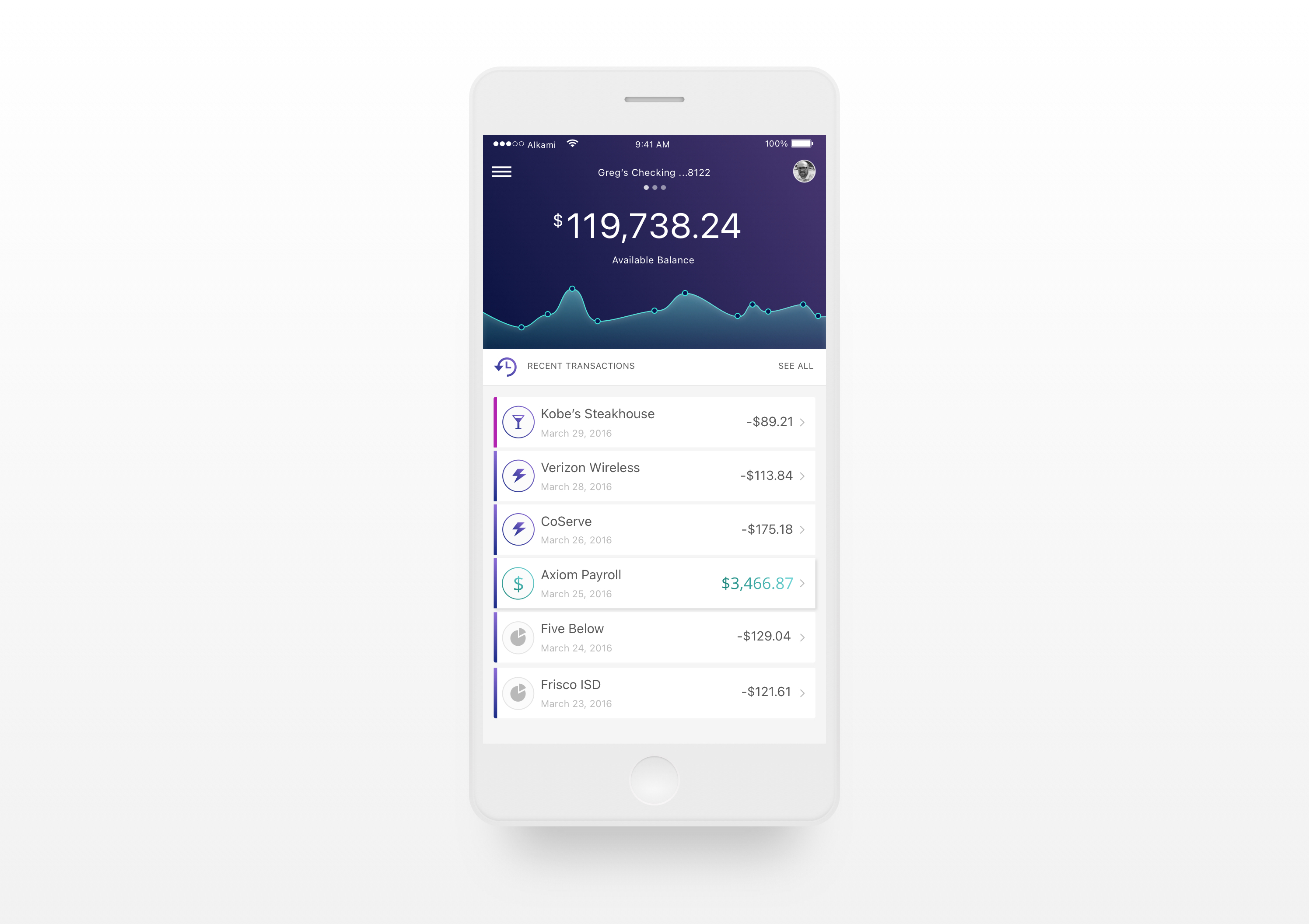
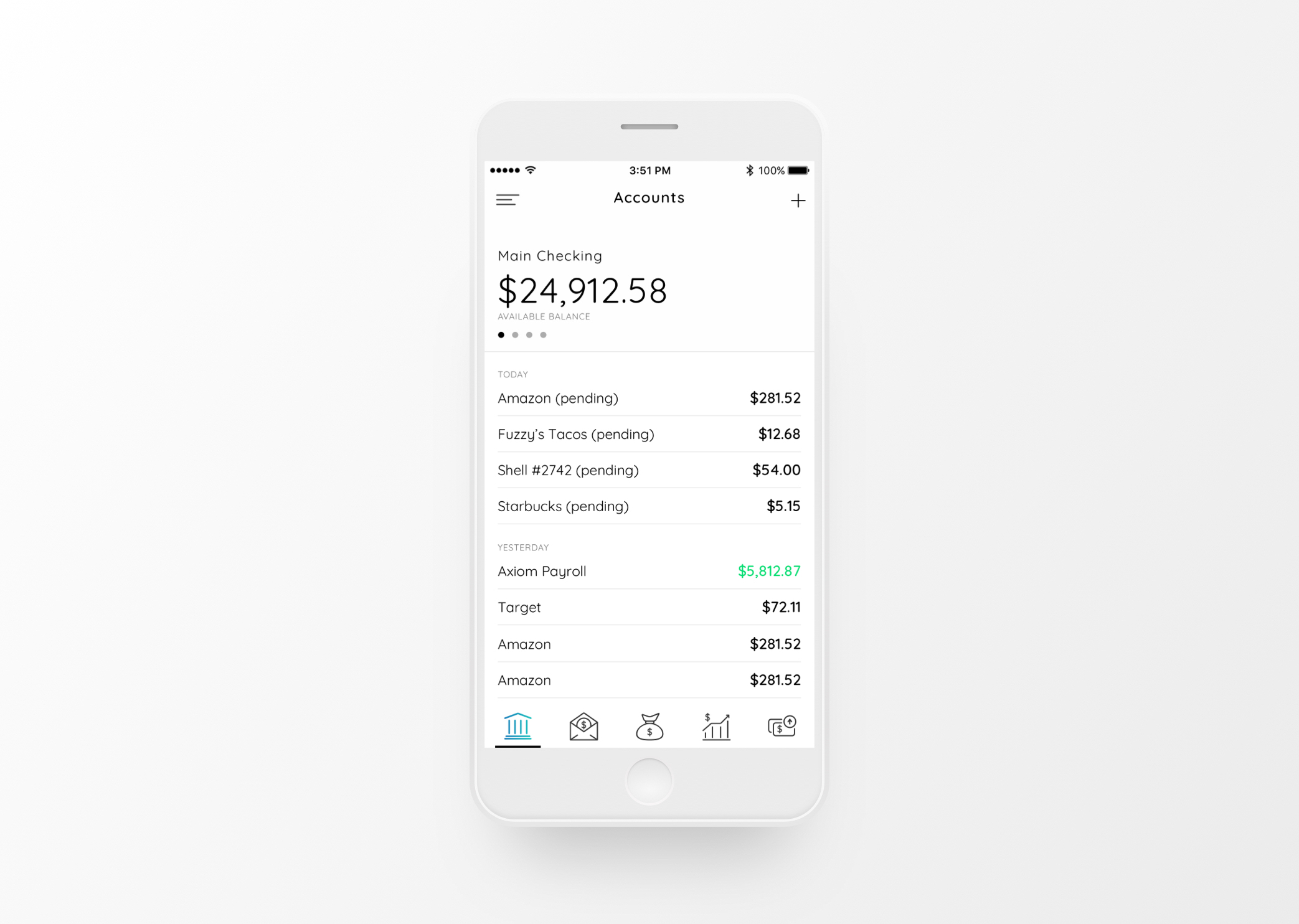
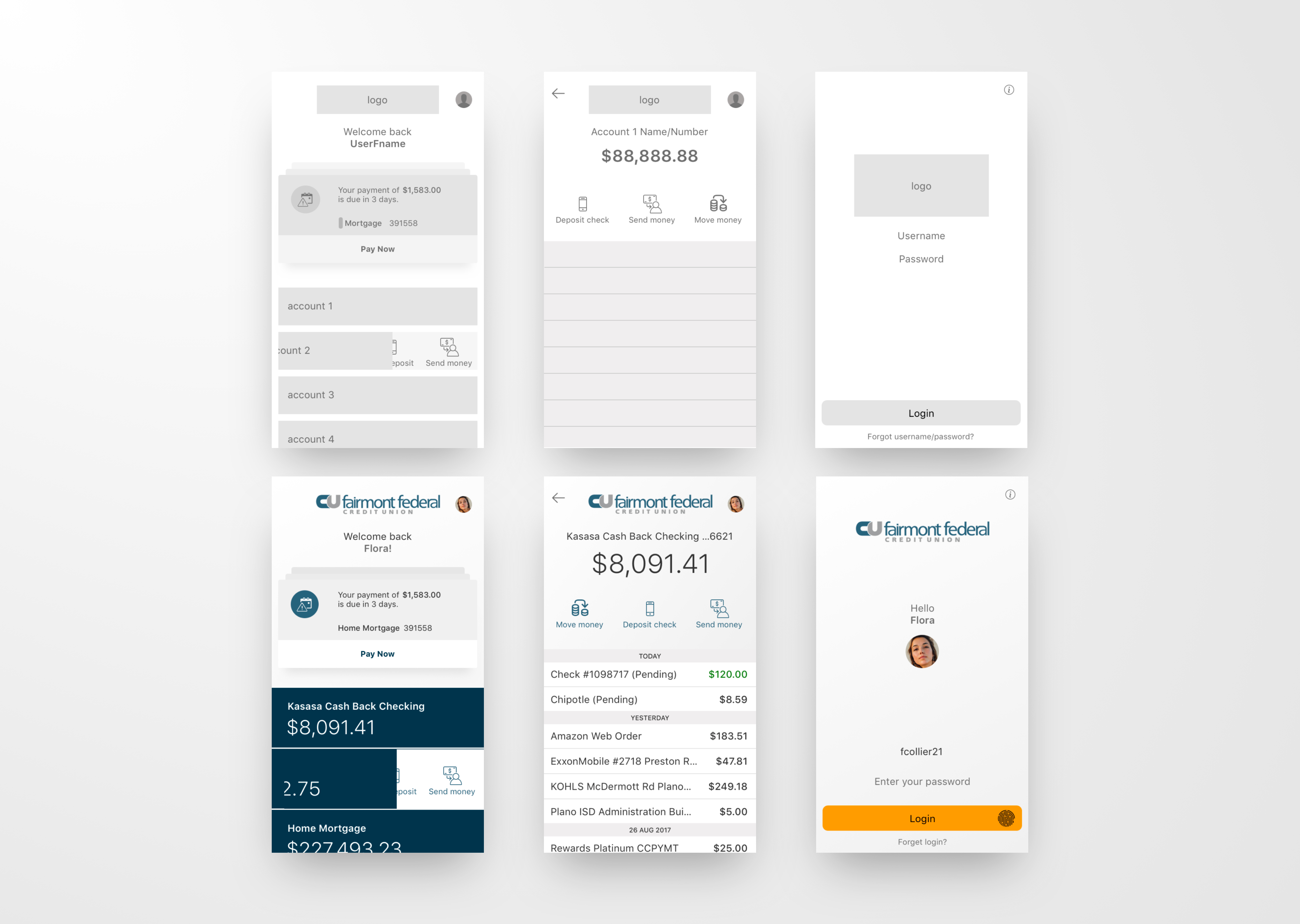
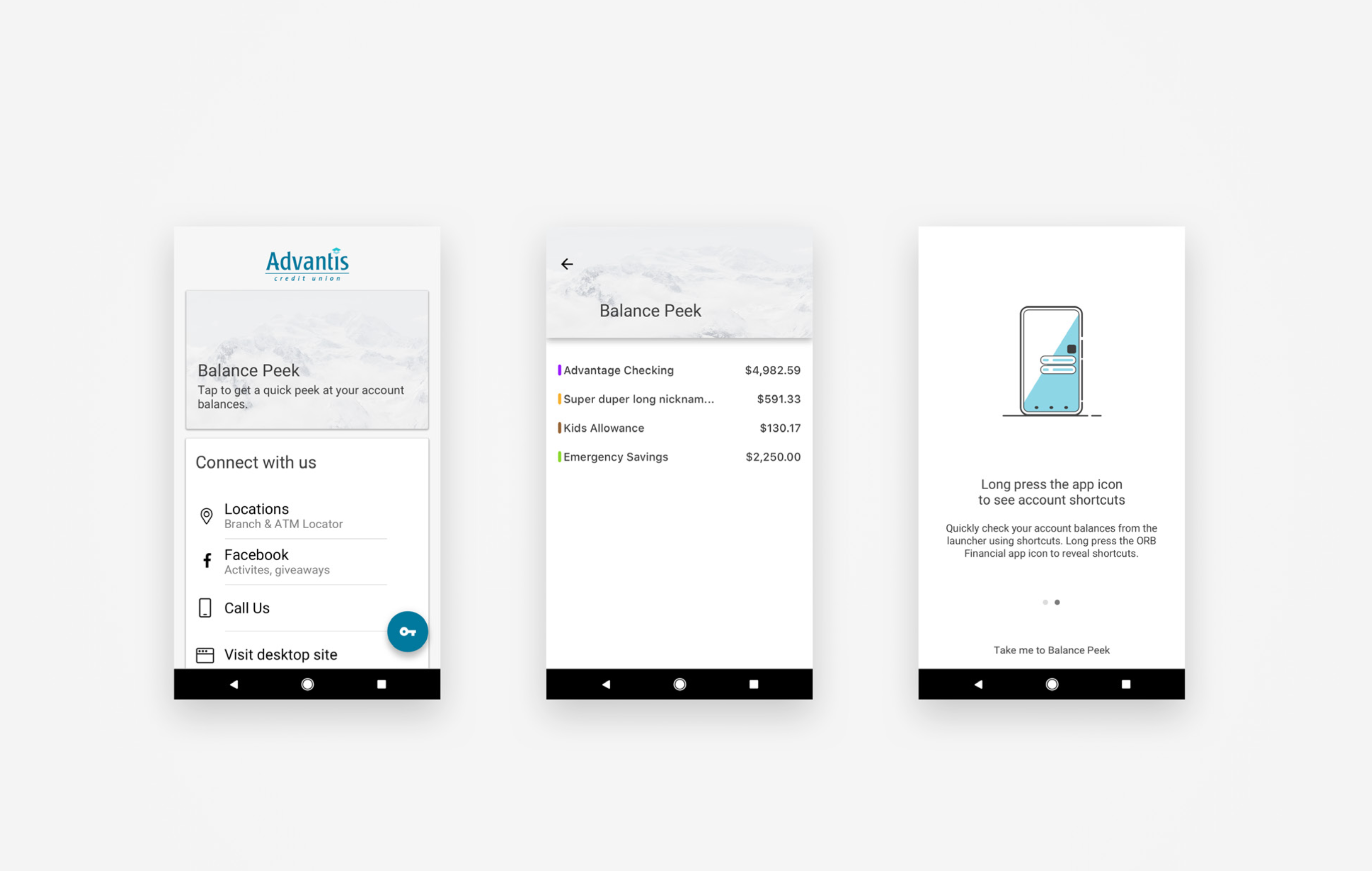
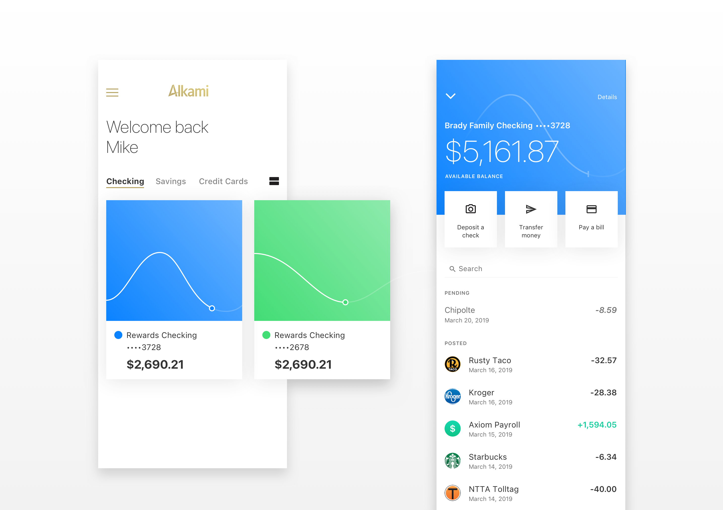
The first phase was pure exploration — understanding the visual zeitgeist of what modern banking apps looked like, and what would resonate with both clients and end users.
Getting Client Validation
Each year the annual Alkami client conference brought hundreds of financial institution decision-makers together — a perfect forcing function. Rather than wait for an internal greenlight, we brought three distinct prototypes and put them in clients' hands directly.
All three scored above 1.0 on the heuristic evaluation and above 95 on the SUS. Clients were enthusiastic about all three, which gave us confidence we were heading in the right direction — and gave us a signal that the final design should synthesize the strongest elements of each.
The engineering roadshow followed. Rather than present the mobile experience as a finished handoff, we brought engineers and architects into the process. We used a "power triangle" framing to help stakeholders see the tradeoffs and make the path forward feel shared, not imposed.
The Solution
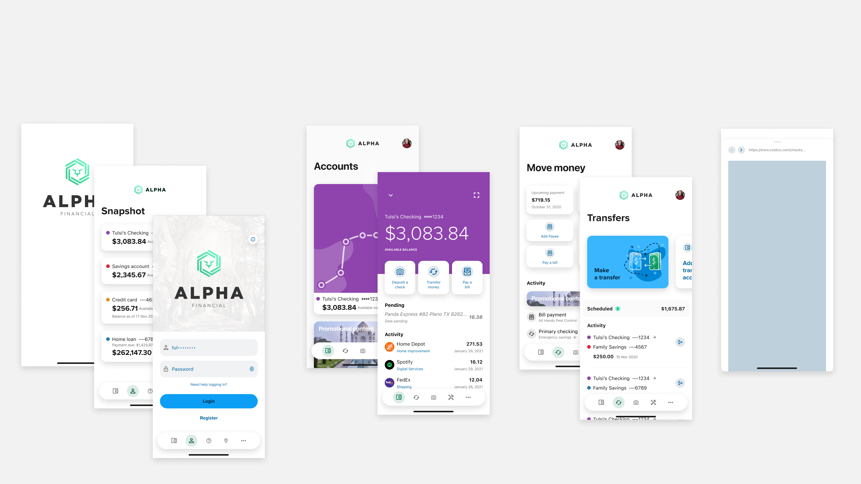
Using the newly defined Alkami Design Language and components from the second-generation design system, the final proof of concept addressed every item on the success metric list.
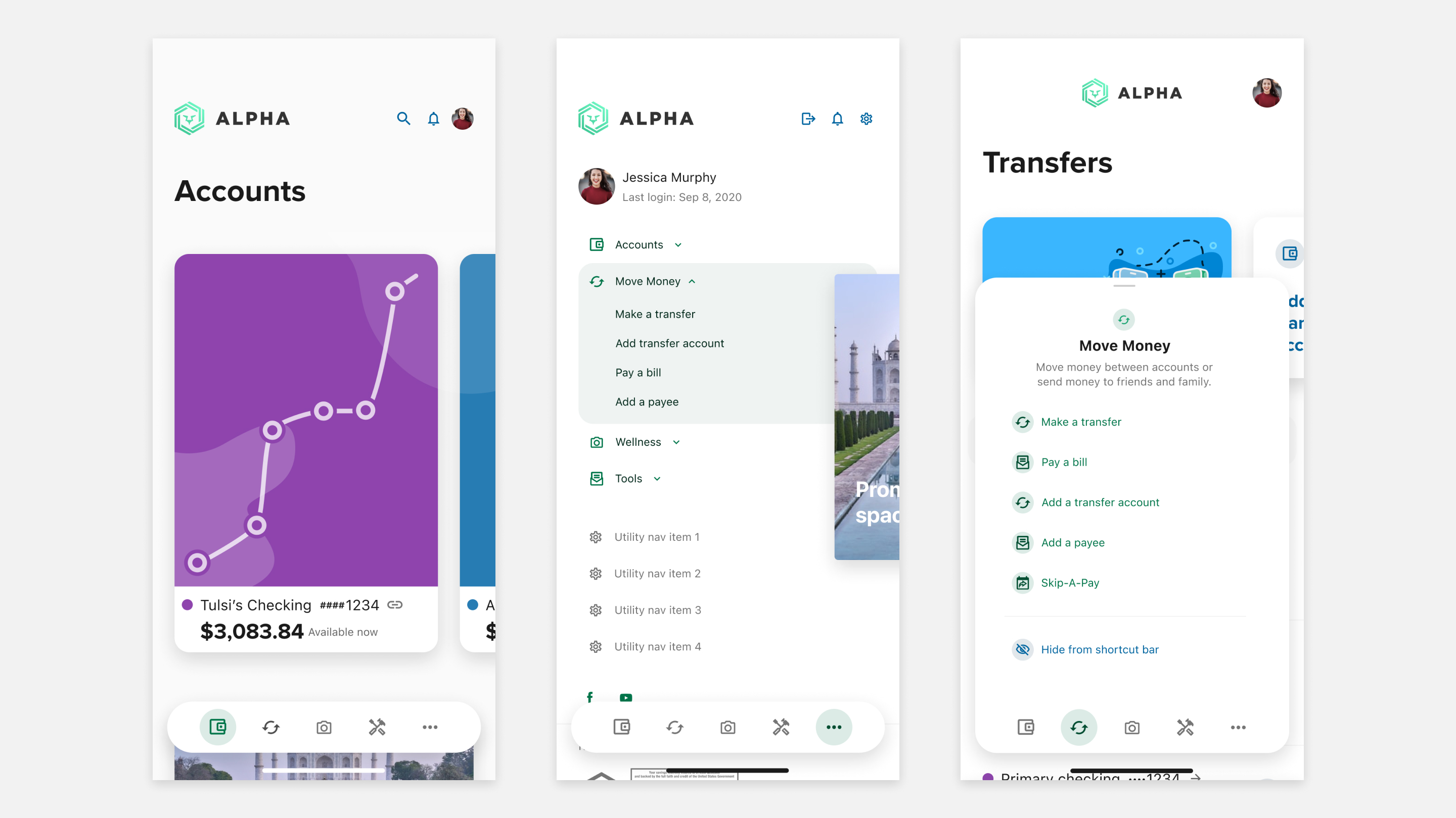
Three new navigational constructs replaced the widget drawer:
- Shortcut bar — a persistent bottom nav anchoring the most common tasks
- More menu — overflow destination for the full feature catalog
- Local navigation drawer — triggered by long-pressing a shortcut bar item, surfacing contextual sub-navigation
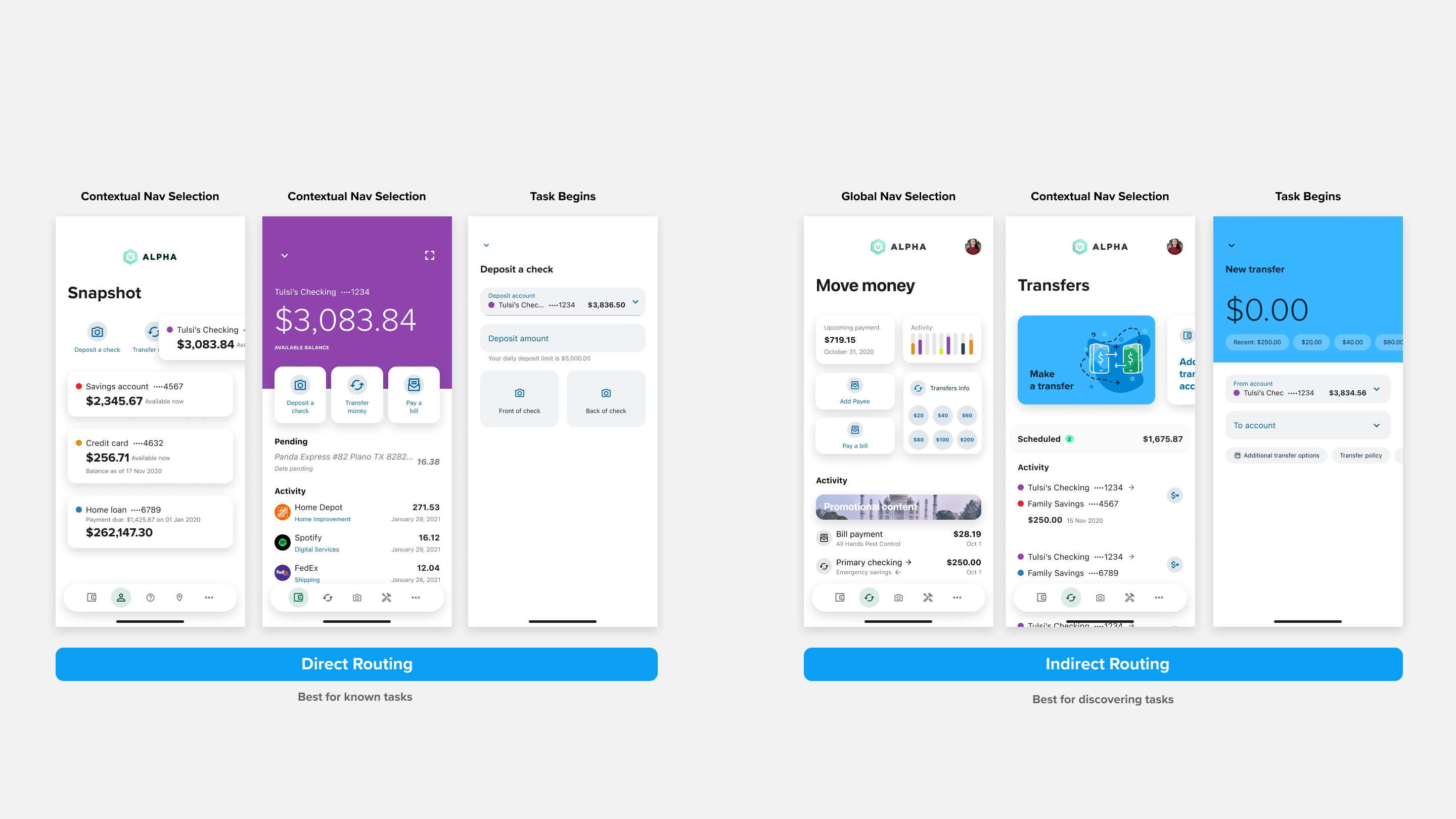
Task routing got a rethink too. Direct routes (one tap to start a task) and indirect routes (browse to it) coexisted — meeting users wherever they were in their mental model.
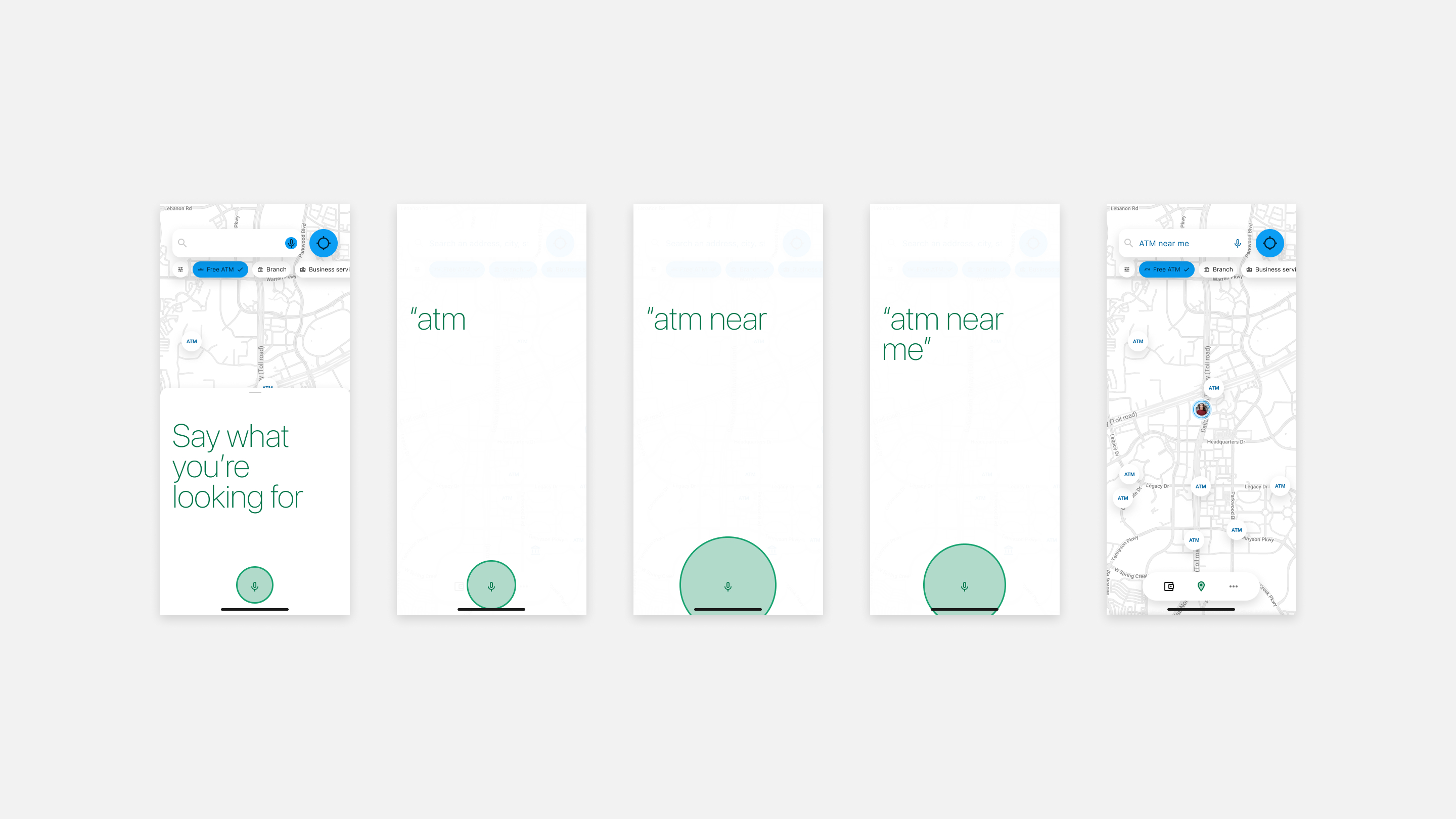
Other highlights below — voice search for locations, effortless account expansion, financial wellness motion, check deposit in a single swipe, and native crypto integration.
Implementation
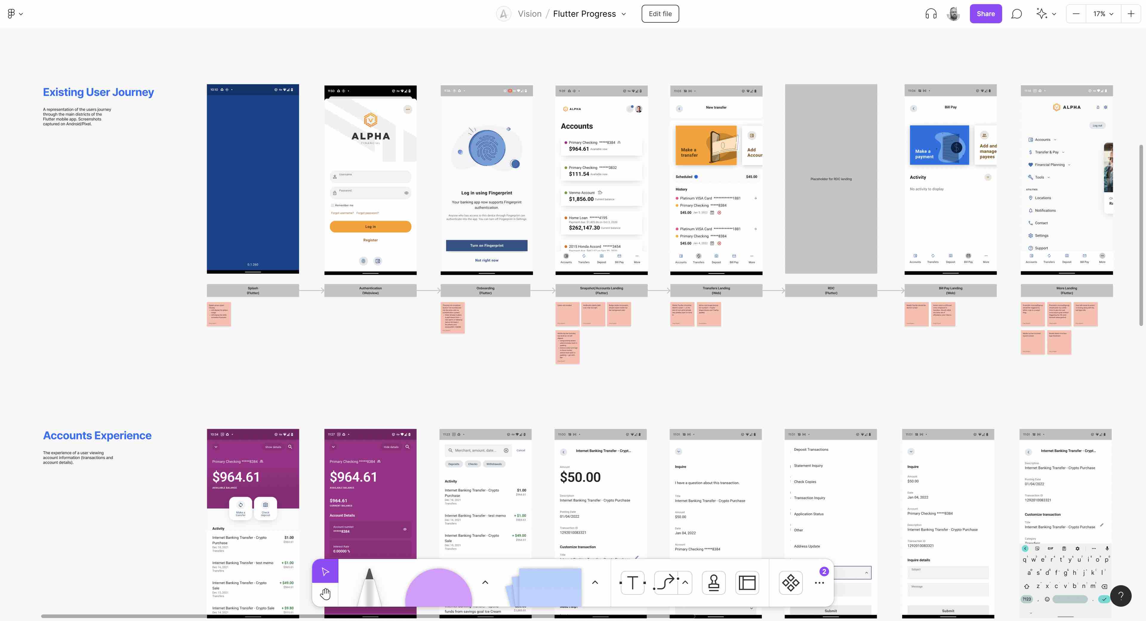
Once the concept was approved as the mobile north star, implementation moved to FigJam for collaborative QA. Anyone with the TestFlight build could tap through the app, screenshot discrepancies, and drop them directly into the working file with a sticky note. Leads reviewed issues weekly and created tickets for iteration.
Outcome
The mobile experience concept became Alkami's official mobile product strategy. It was presented at the annual client conference on the main stage, and the response from clients directly accelerated commitment to the Flutter-powered rebuild.
The mobile design system spun up as a direct result of this project, which almost immediately expanded into the second-generation design system covering both mobile and desktop — completing the loop on the whole platform's visual evolution.
Looking back: the biggest thing I'd do differently is staff a dedicated innovation team running continuously, rather than pulling designers off their main workstreams at key moments. The peaks and valleys in velocity were a function of shared resources, not the work itself.