Alkami Information Architecture
Overhauled the navigation architecture for a digital banking platform that had scaled past the limits of its original design — replacing a 100+ widget drawer with a self-serve navigation builder.
Overview
Alkami's navigation had been the same since the platform launched: a configurable drawer of "widgets" that financial institutions could toggle on or off. In the early days, when the platform had a modest feature set, this worked fine. By 2020, clients were managing catalogs of 100+ widgets — and the drawer had become a navigation anti-pattern.
The deeper problem was operational. Clients couldn't manage their own navigation structures. Every change — every reorder, every segment-specific menu — required a support ticket, a project, and an Alkami resource. At the scale Alkami was operating, this wasn't sustainable.
The Challenge
Two distinct problems needed solving together:
The experience problem: A drawer of 100+ items isn't a navigation system — it's a list. Users had no reliable mental model for where things lived. The hierarchy was flat, the organization was arbitrary, and there was no distinction between core tasks and occasional ones.
The operations problem: Financial institutions serve multiple user segments — retail customers, business customers, youth accounts. Each segment legitimately needs a different navigation experience. The existing system had no concept of segmentation. Every client got one menu, configured once, changed via support ticket.
The Concept: Buckets
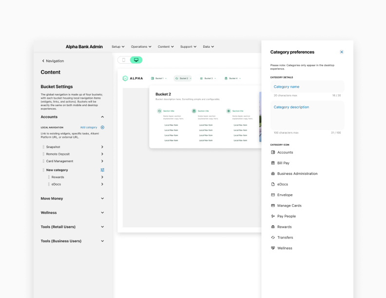
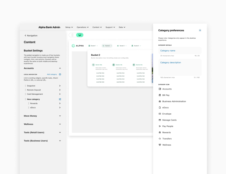
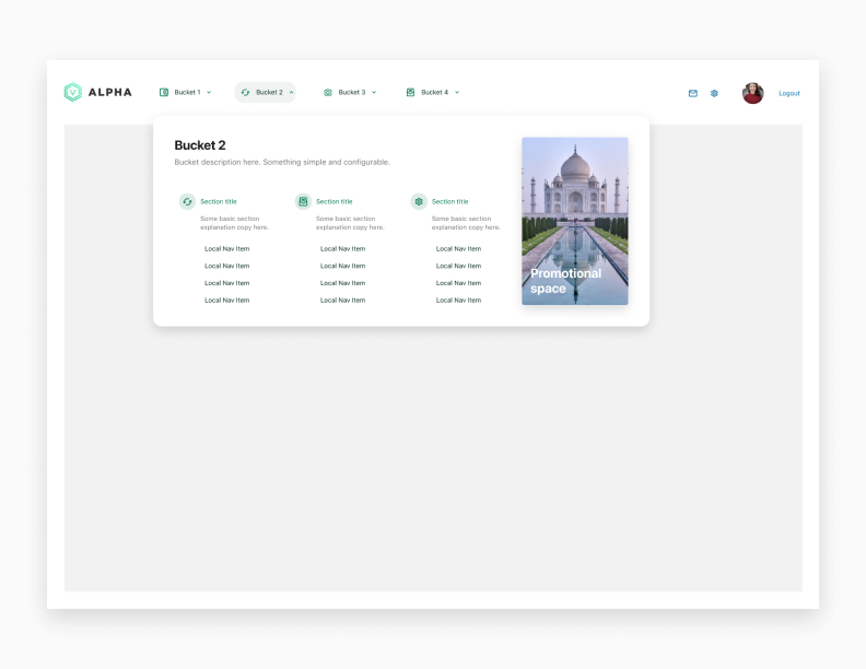
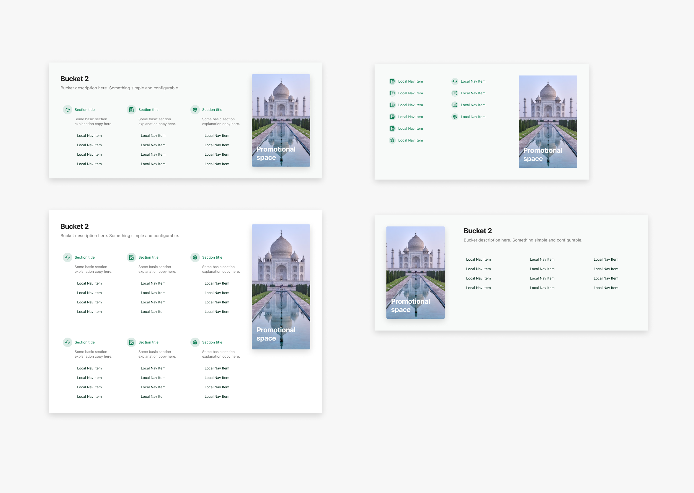
The solution centered on a concept we called "buckets" — containers that hold navigation items for a specific user segment. A client could configure a default menu that applied to everyone, then layer on segment-specific menus for retail, business, youth, or any other segment they supported.
The navigation builder UI let clients manage this themselves: add items, reorder them, assign them to buckets, preview the result. No support ticket, no Alkami project — self-serve from the client admin portal.
Mobile and Desktop
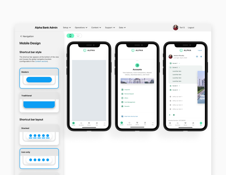
The bucket system needed to work across both mobile and desktop banking experiences, each with different navigation patterns and constraints.
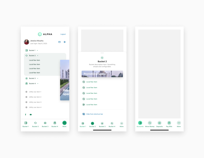
On mobile, the shortcut bar and local nav drawer (built alongside the mobile experience redesign) became the primary navigation surface. The bucket system powered what appeared in those constructs — giving clients control over what their users saw in the most valuable navigation real estate.
On desktop, buckets mapped to a sidebar and top navigation structure with more room for hierarchy and grouping.
Outcome
The navigation builder gave clients genuine ownership of their user experience for the first time. Segment-specific menus meant retail and business users could have appropriately different navigation without requiring custom engineering work per implementation.
The "buckets" model also proved durable — it established a vocabulary and a mental model that the product team could extend as the platform grew, rather than having to redesign navigation every time the feature catalog expanded.