Alkami Design System
Led the design of a multi-platform component library and design language for a white-label SaaS digital banking platform serving hundreds of financial institutions.
Overview
Alkami's digital banking platform is white-labeled — every credit union and community bank that licenses it ships it under their own brand. That constraint makes design systems both harder and more critical than usual. Every component needs to work across web, iOS, and Android, and every color, icon, and spacing value needs to be overridable without breaking the visual logic.
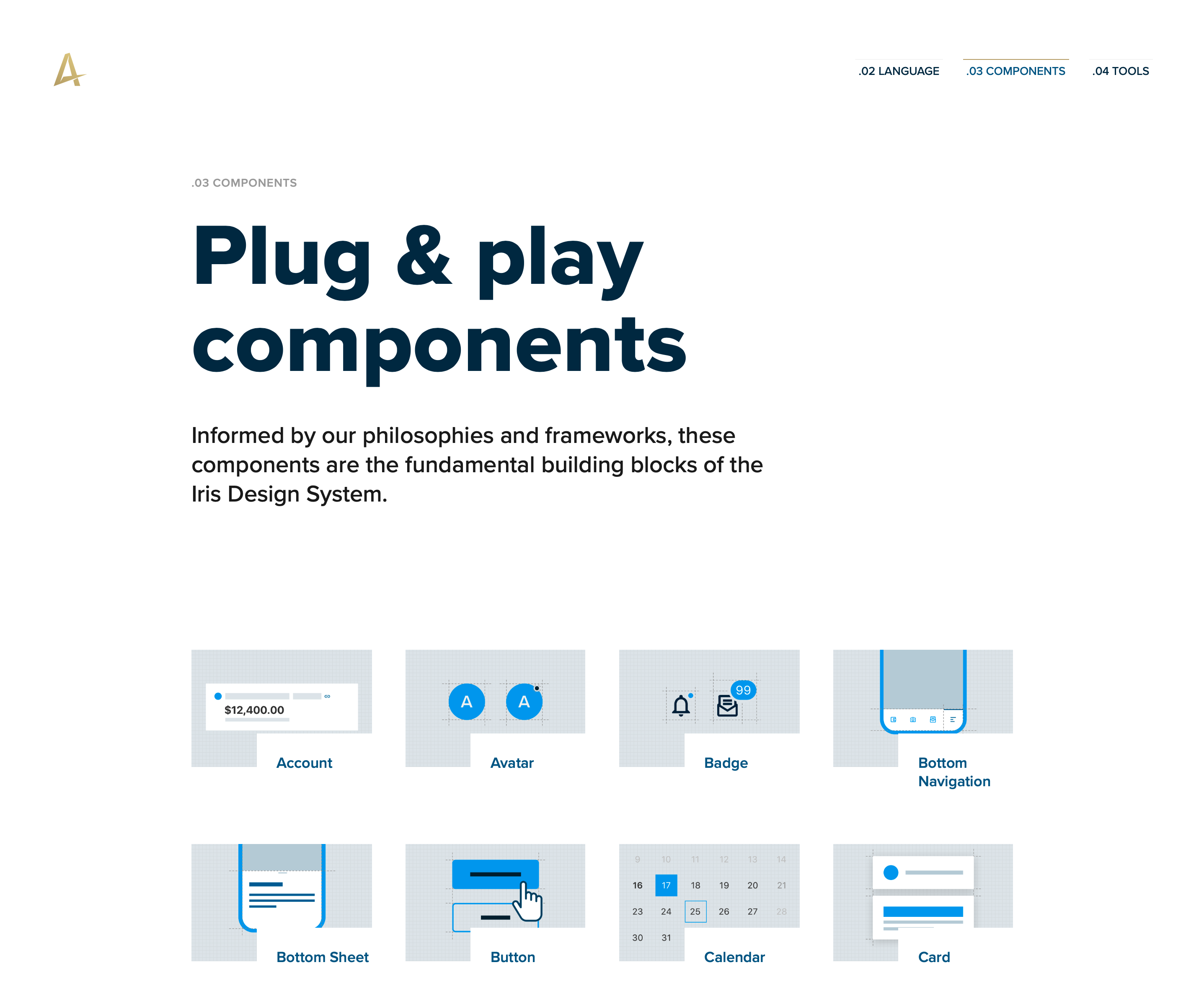
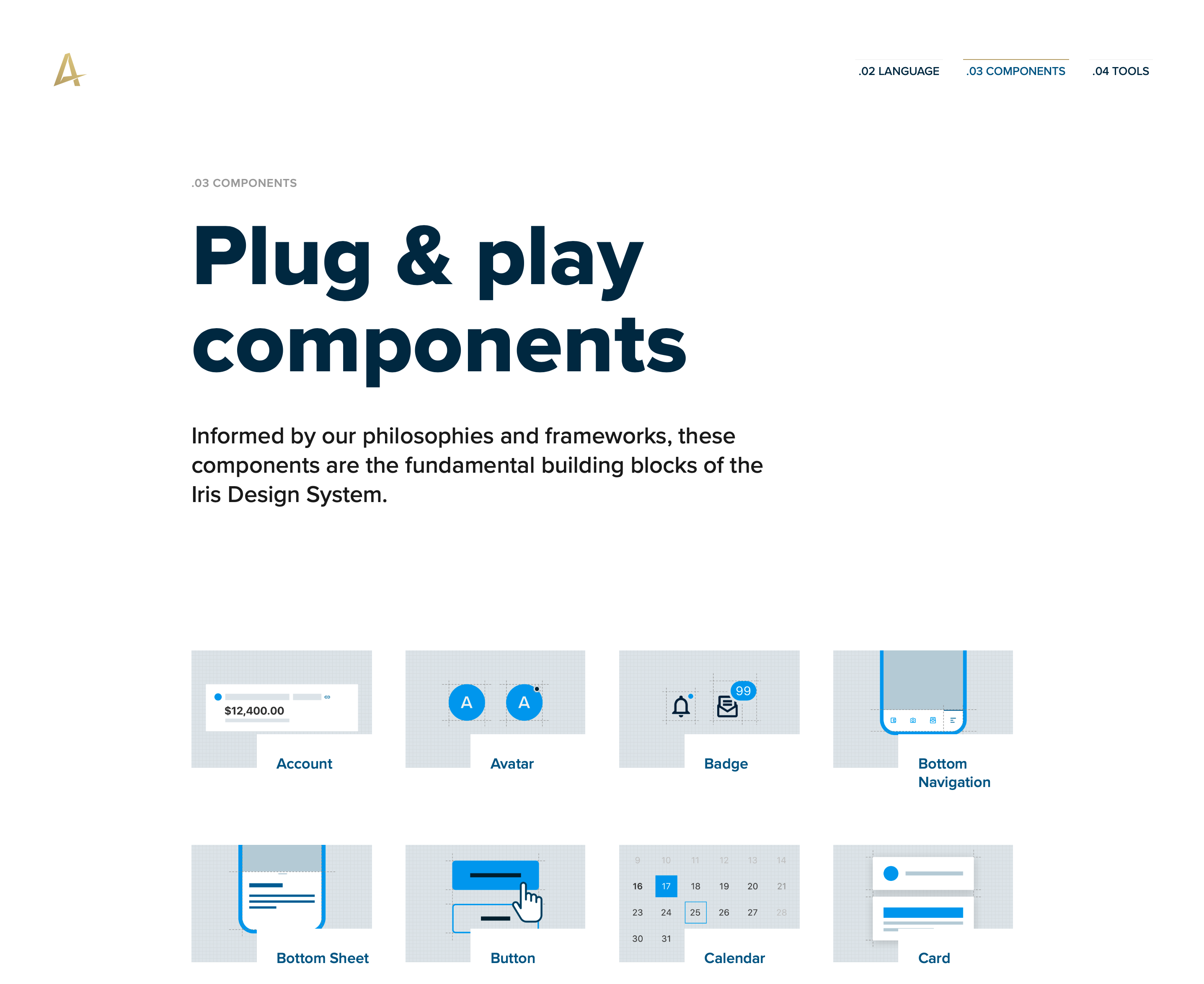
When I took over design systems at Alkami, we were running on a legacy desktop-only library with inconsistent patterns across 14 scrum teams and no scalable theming architecture. Over three years, I led the design and governance of a second-generation system that replaced it — 40+ components, 100+ variants, a token-powered theming engine, and documentation for both designers and engineers.
The Challenge
The real challenge wasn't designing components — it was making the case for dedicated time and resources while every team had production commitments that couldn't slip.
The specific problems the new system needed to solve:
- No mobile-first or touch-friendly patterns in the existing library
- Each new client required bespoke theming work, blocking the sales team from scaling
- 14 scrum teams each maintaining their own HTML snippets — no shared source of truth
- No mobile SDK, so third-party integrations required in-house custom work every time
- The visual aesthetic had aged out — losing deals to newer competitors
We had no dedicated project budget. So we carved out time around existing workstreams and ran a skunkworks project until we had enough momentum to make it undeniable.
Building the Team First
I'd seen what happens when a small group designs a system in isolation and then tries to get everyone else to adopt it. It doesn't work. Adoption starts at the beginning, not at launch.
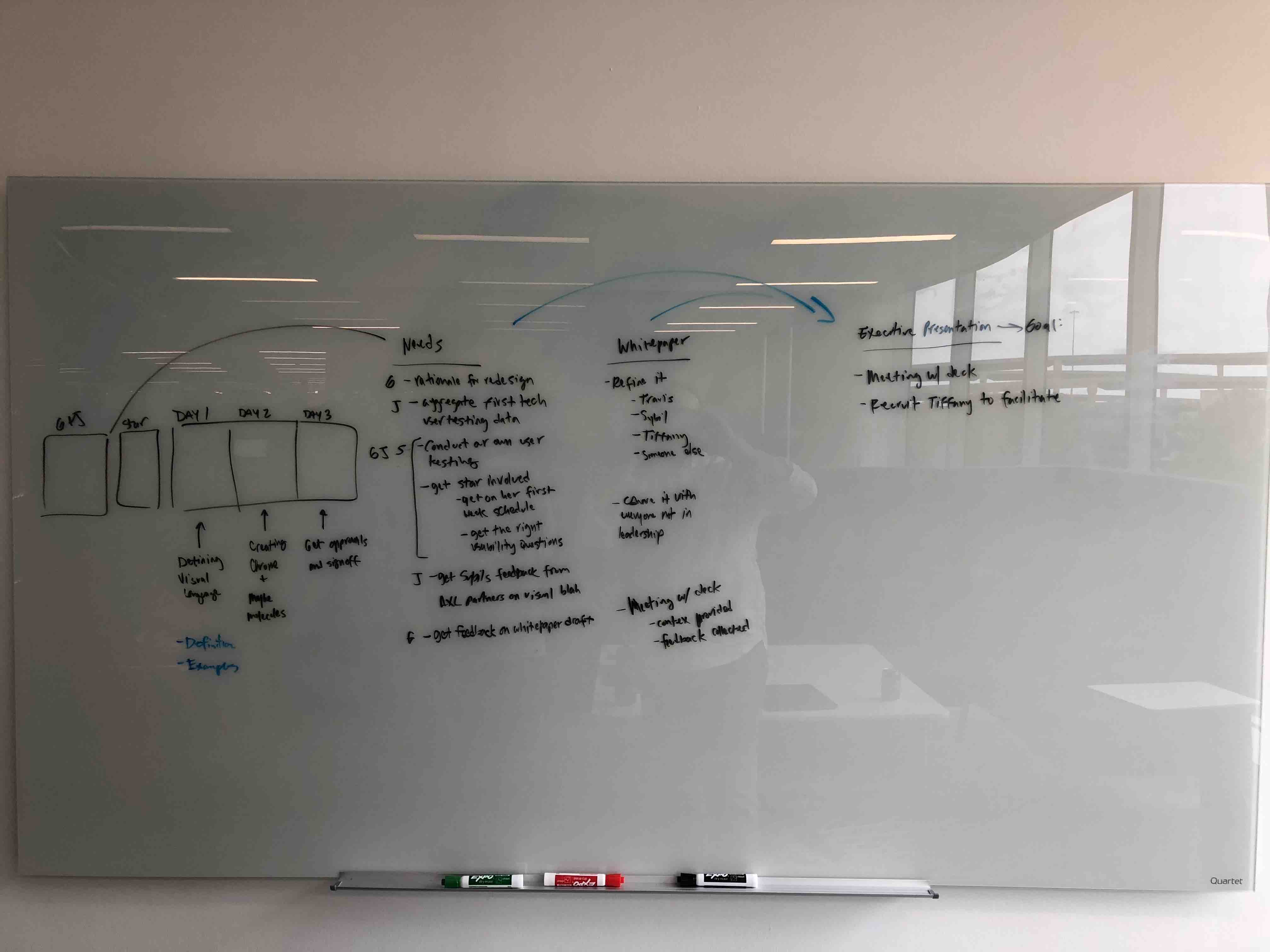
So before we designed a single component, I organized a full-day off-site for designers and engineers across the web, iOS, and Android teams. Rented coworking space, catered lunch, swag bags, the works. The goal wasn't to produce deliverables — it was to come out the other side with a shared set of design philosophies and principles everyone had a hand in building.
That investment paid back immediately. When we had debates later about spacing or emphasis decisions, we could resolve them by checking them against principles the team had co-authored, not just my opinion.
The 7 Design Frameworks
As we worked through early components, we kept hitting the same decisions: how much spacing here, what level of elevation for this surface, which color carries affordance vs. guidance. Over time we realized we were rebuilding the same reasoning over and over.
We pulled those decisions out and codified them as frameworks — not a style guide, but a set of repeatable rules that could generate consistent answers to recurring questions. Seven of them emerged:
- Color — intentional, role-based use (affordance, guidance, messaging, platform)
- Typography — scales set at specific sizes and weights to enforce hierarchy
- Icons — line art at sizes calibrated to align with type and other atoms
- Spacing & Sizing — based on 8, scaling with the golden ratio
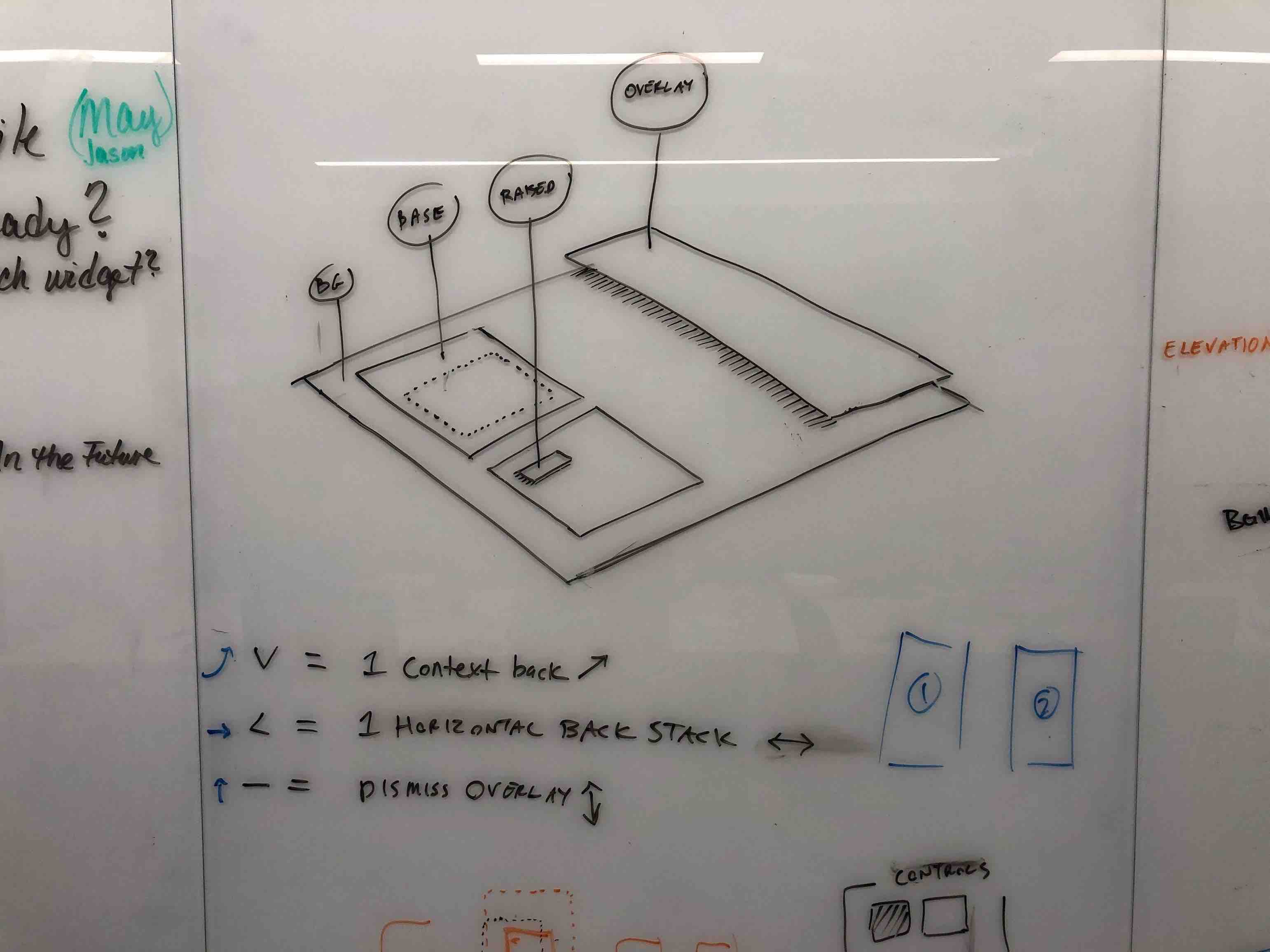
- Elevation — surfaces and z-axis logic, extending Material Design's model
- Emphasis — how to draw the eye or create separation without relying on color alone
- Motion — what happens as elements change shape, size, and visibility
Once the frameworks existed, velocity picked up significantly. Debates that used to take an hour got resolved in minutes.
Delivering It
Three deliverables shipped for three different audiences:
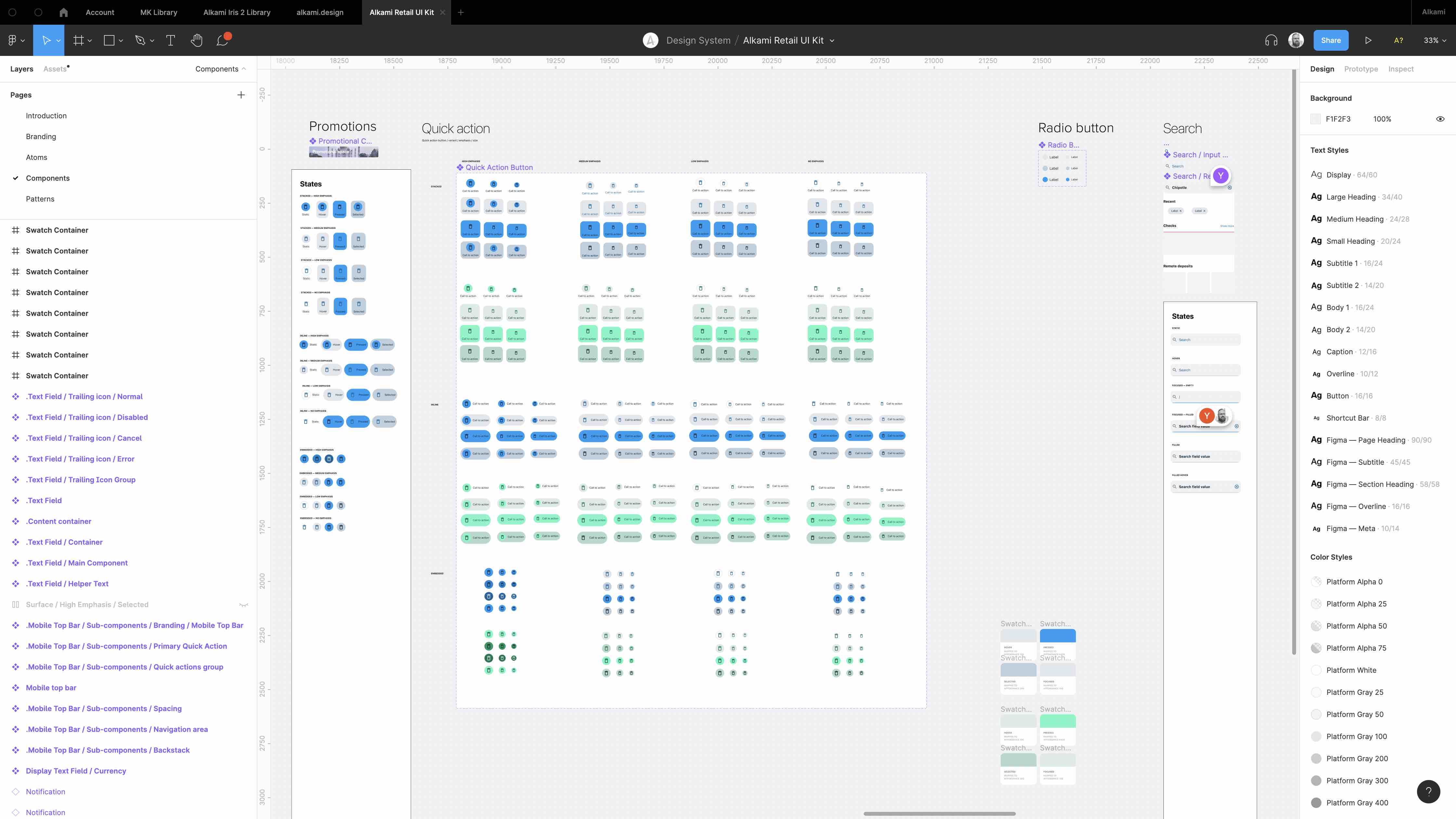
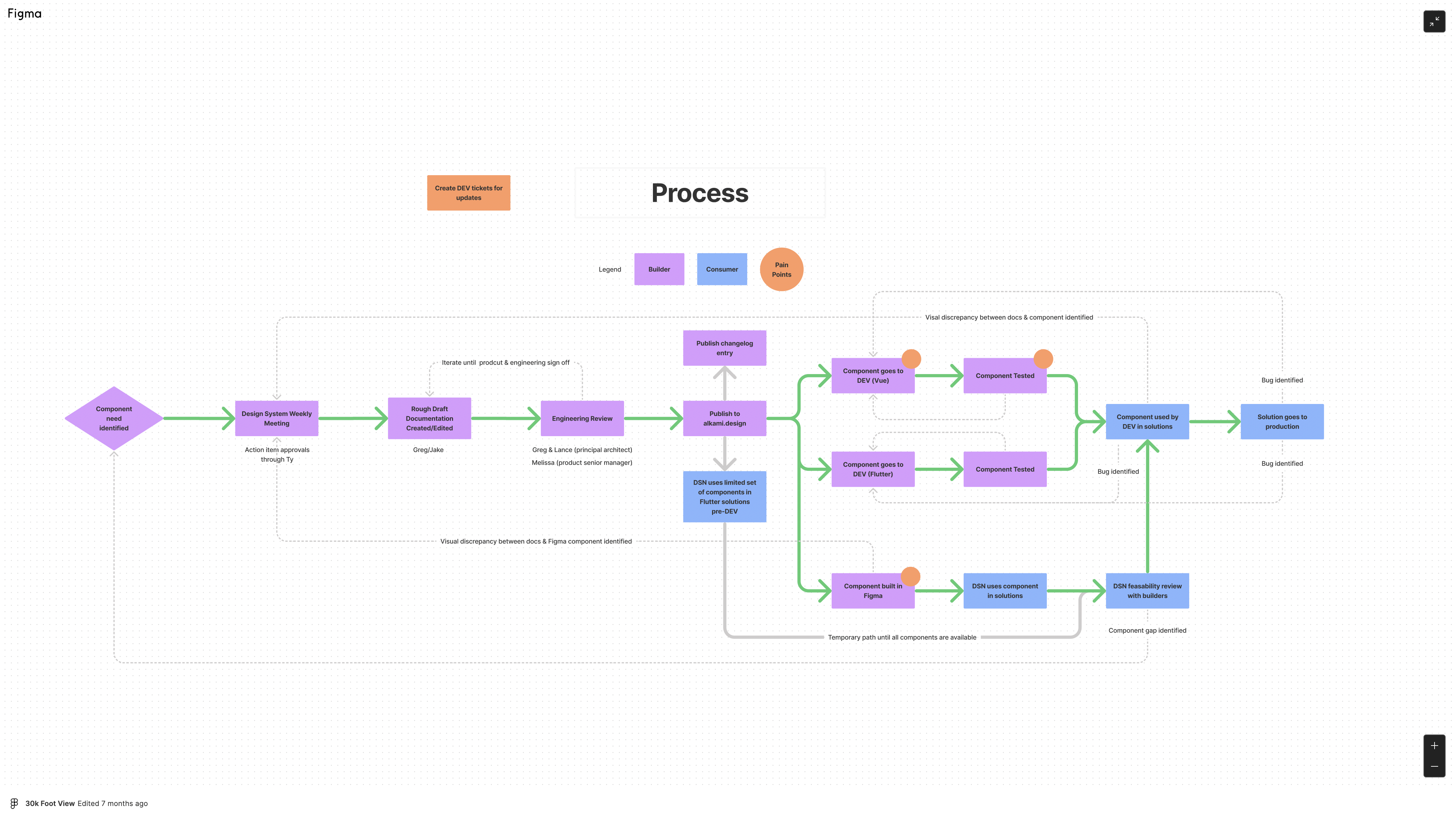
Figma library + documentation site for designers — built in Webflow, with each component tagged by size, interaction type, atomic level, and themability. Collaboratively authored in Google Docs before being transferred to the CMS, with engineering sign-off before any component was considered documentation-ready.
Storybook for engineers — self-documenting, living alongside the code. Engineers could browse components in isolation without needing to open Figma.
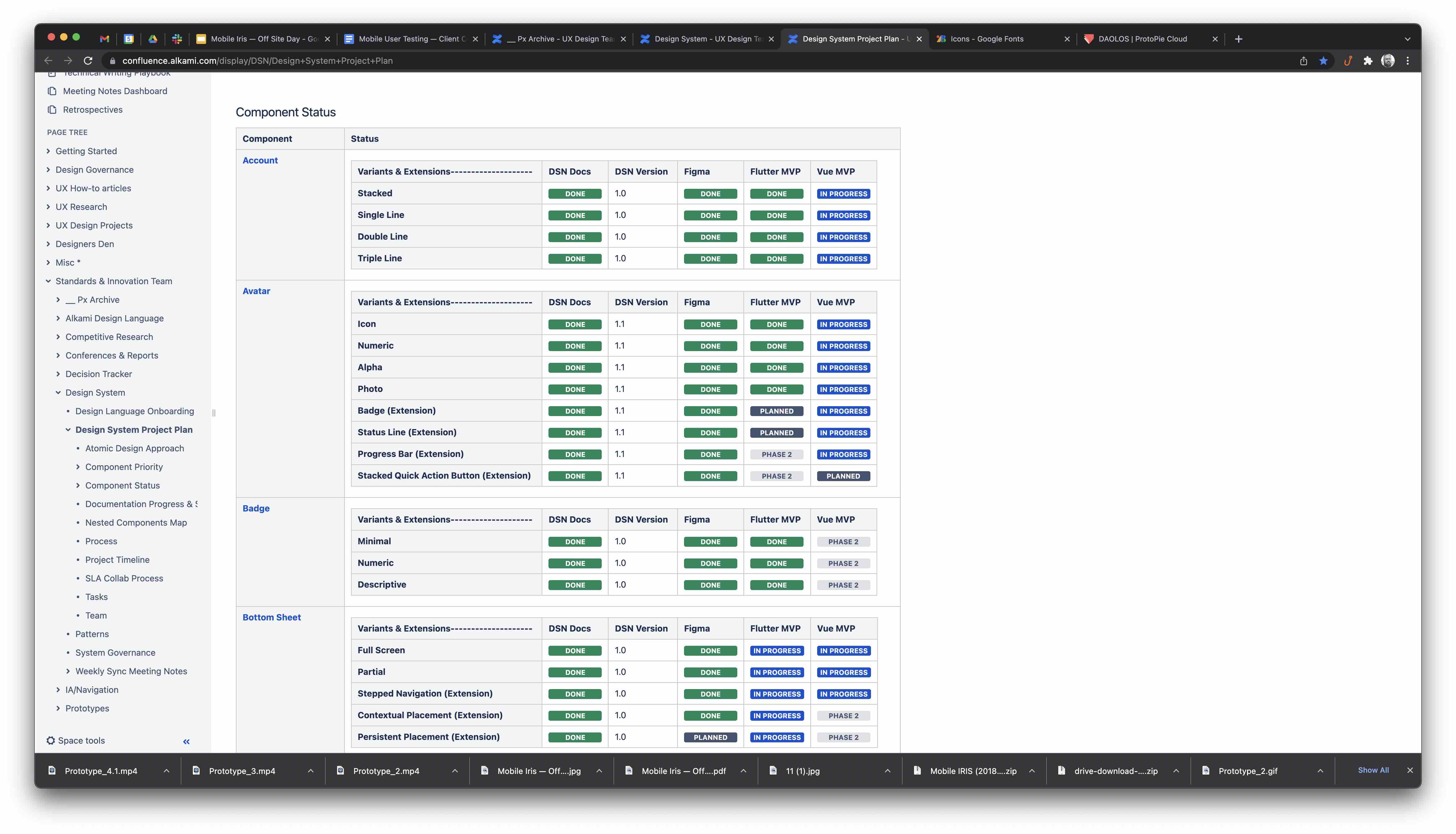
Confluence space for stakeholders and product — tracked component status, release timelines, and the weekly sync agenda.
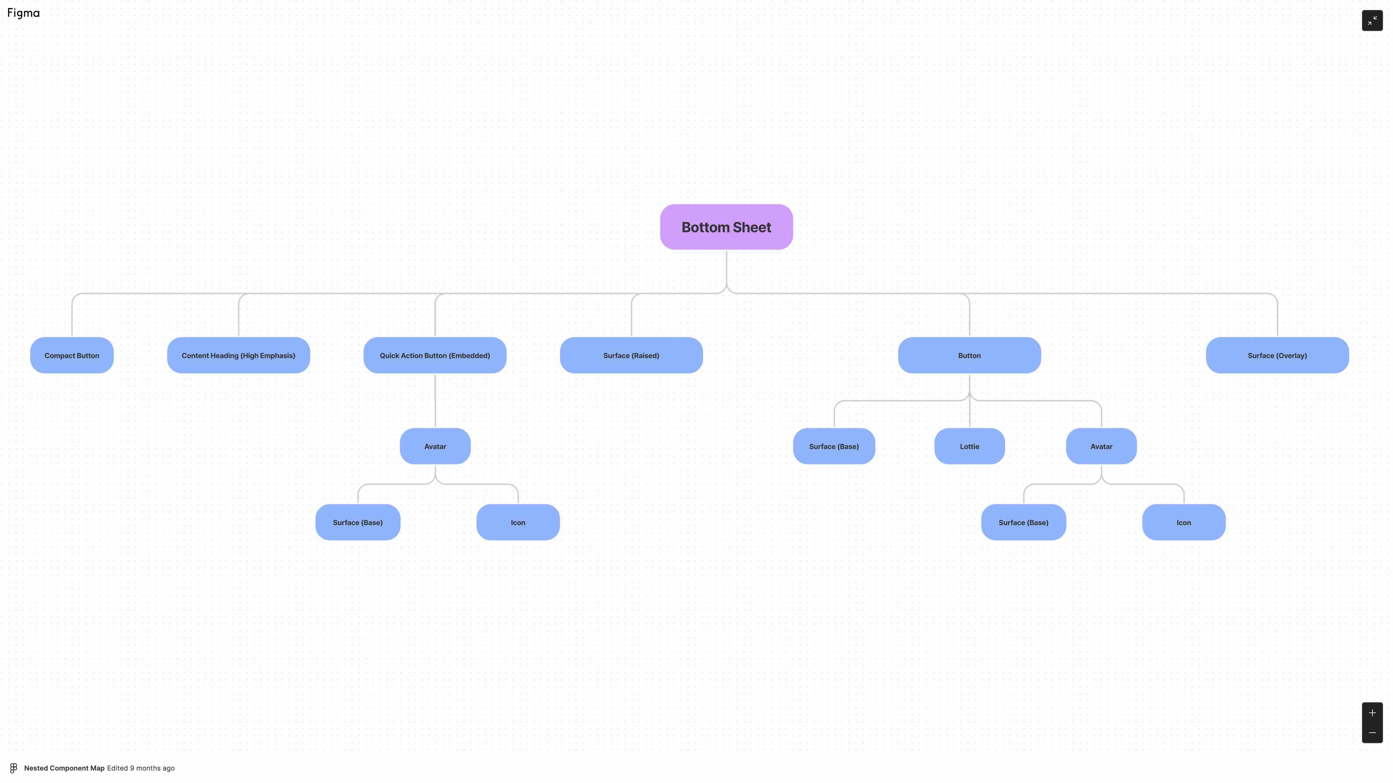
Component design and documentation were staggered two weeks ahead of engineering development for each batch. That lead time gave engineers visibility into what was coming and let us catch feasibility issues before code was written.
Three clickable prototypes were built and put in front of clients at the annual conference — each representing a distinct visual direction. All three passed the success metrics. The client feedback fed directly back into the final component library and mobile experience north star.
Governance
One of our core design philosophies: design is never done. That's especially true for systems. We formalized it with a service level agreement between the system team and the consuming teams — a documented process for surfacing bugs, requesting new features, and tracking iterations.
Without a governance model, design systems become abandonware. The SLA gave consuming teams a reliable channel and gave us a way to batch and prioritize requests without losing the thread.
Outcome
The second-generation Alkami Design System shipped with 40+ components and 100+ variants, covering web (Vue), iOS (Flutter), and Android (Flutter). The token-powered theming engine replaced hundreds of hours of bespoke client theming work per year. The mobile-first component library directly enabled the new mobile experience that leadership credited as a key factor in the company's Q4 2021 sales growth.
More durably: the team that built it was the team that used it. Adoption was never a fight because buy-in was built in from the start.
The biggest lesson looking back: find your champion early. Carving out time around other commitments is survivable — but real velocity requires someone with the organizational authority to protect the project from being deprioritized at the next sprint planning.