Dynamic Color Ramps
Designed a programmatic, accessibility-first color system that auto-generates full ramps from a single brand color — eliminating bespoke theming work for hundreds of financial institution clients.
Overview
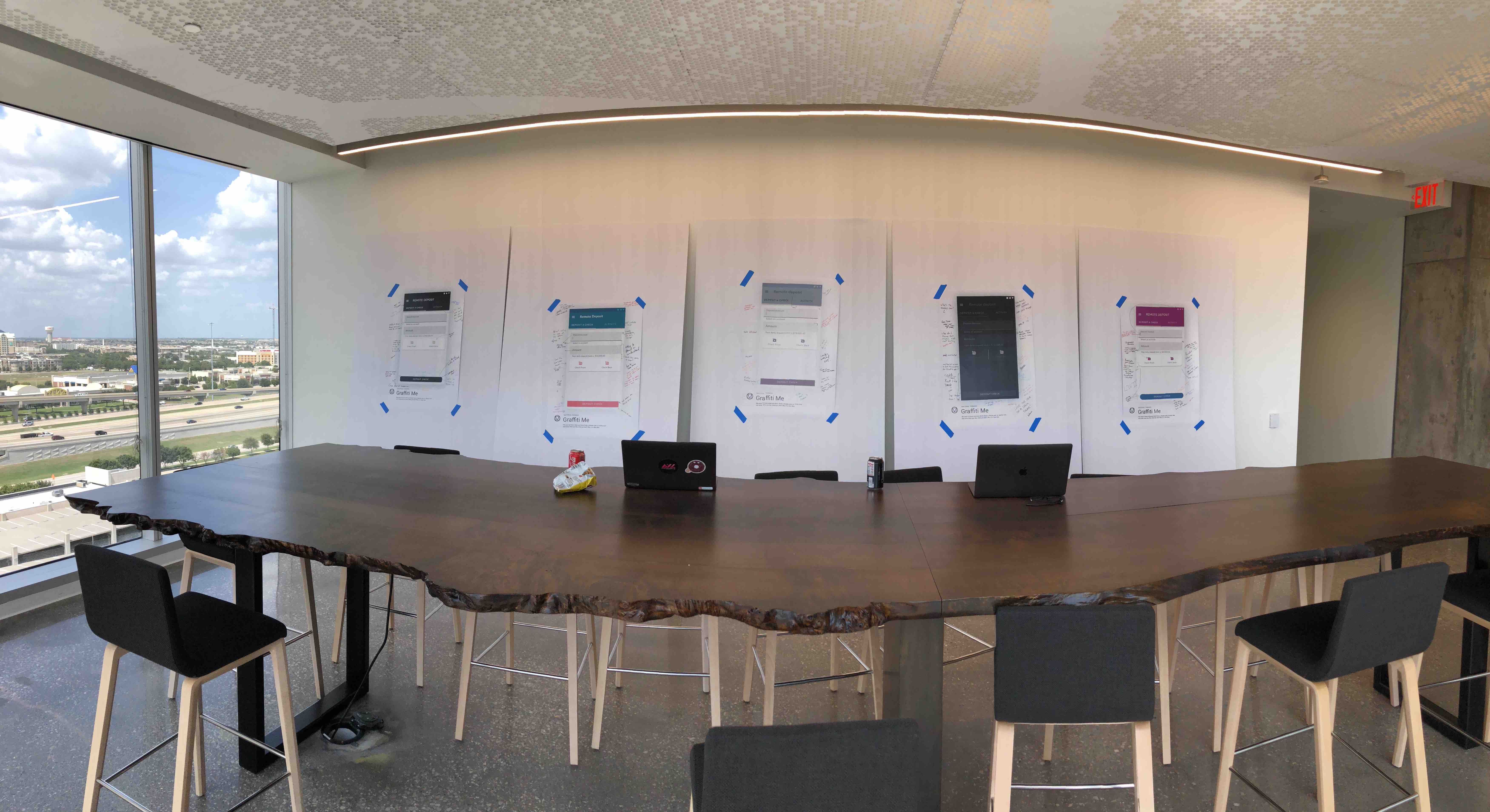
Alkami's white-label platform served hundreds of financial institutions — each with their own brand colors. For years, every new client meant a custom theming project: a designer manually building out a color palette, an engineer writing bespoke CSS to make it work, and an accessibility review to catch contrast failures before launch.
It didn't scale. And as the design system matured and needed a richer set of semantic color roles (affordance, guidance, error, success, emphasis), the bespoke approach became a real blocker.
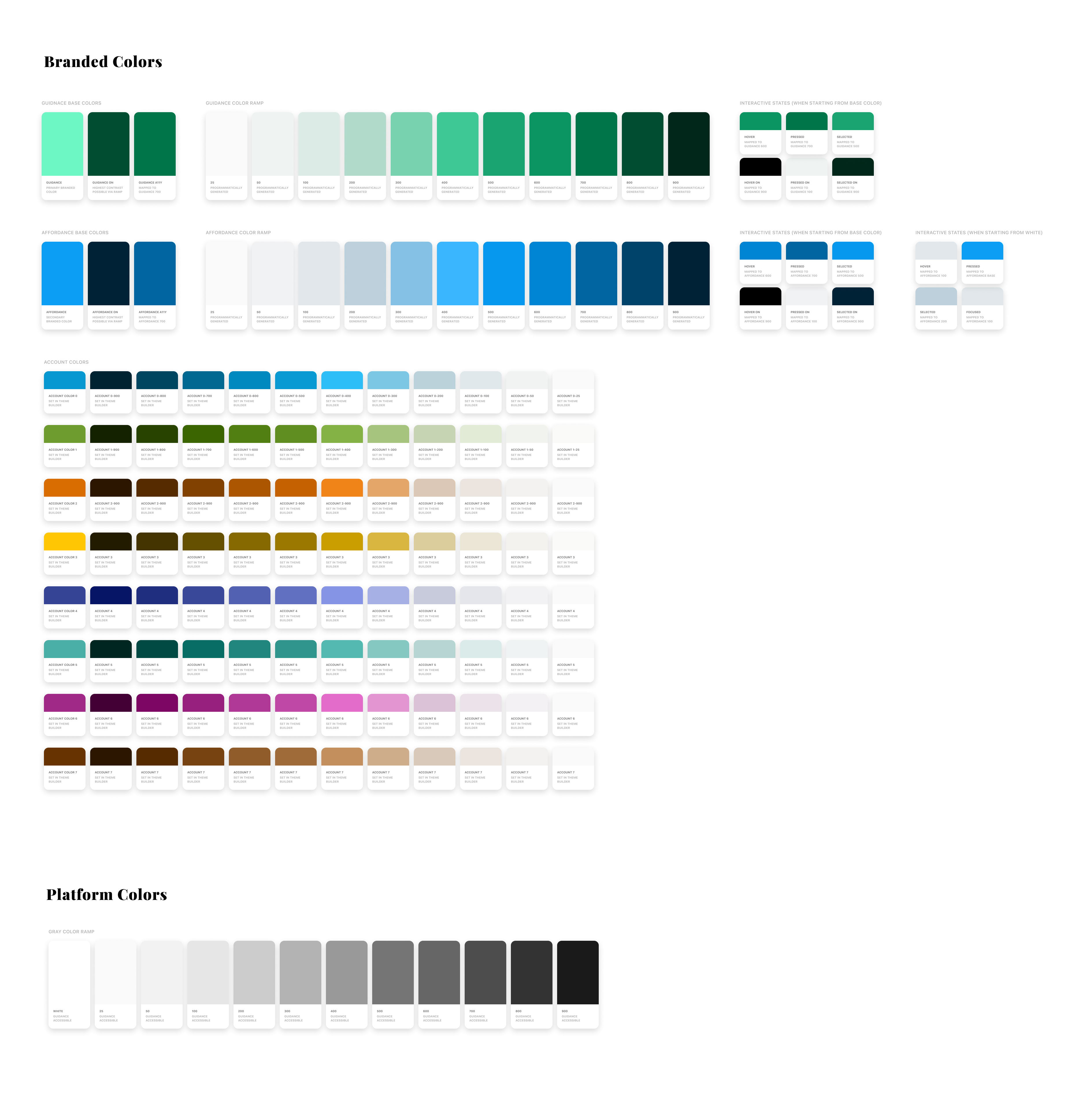
The solution was a dynamic color system: give it a single brand hex, it generates a full ramp of light-to-dark steps, tests every step for WCAG contrast compliance, and exports the result as design tokens. No manual work, no accessibility surprises.
The Challenge
The core problem was math. A color ramp needs to feel visually consistent — each step should read as a predictable increment of lighter or darker — while also guaranteeing a specific contrast ratio at the step used for text or icons on that background.
With hundreds of unpredictable client brand colors, the system had to work on orange, red, teal, navy, and everything in between, without a designer in the loop tuning each one by hand.
Three additional constraints made it harder:
- The engineering lift had to be manageable — a beautiful system that requires a PhD to implement won't get built
- Clients needed some degree of manual control — enough to fine-tune within their brand, not enough to break the system
- The output needed to integrate with the existing token pipeline — JSON, consumed the same way as any other design token
Three Iterations
Iteration 1: Add white or black. The simplest approach — shift each step by mixing toward white or black. Fast to implement, but it produced muddy, lifeless colors at the extremes. Orange ramps looked like rust. Red ramps looked like terracotta. Rejected.
Iteration 2: RGB manipulation. Full control over the color spectrum. Theoretically the best-looking output for any input color. In practice, the math required to hold luminosity consistent at each step across all possible brand colors was a significant engineering lift — and the complexity created edge cases that were hard to reason about. Too expensive.
Iteration 3: HSL manipulation. The HSL model is simpler than RGB — hue, saturation, lightness as independent axes. The math is straightforward, the luminosity control is predictable, and when we tested HSL ramps against the matching RGB ramps with real brand colors, the visual difference was negligible. Simplicity won.
Accessibility by Default: On Colors
Every ramp needed a paired "on color" — the color used for text or icons sitting on top of any given ramp step. Getting this wrong means shipping contrast failures to production.
The system automates it:
- Generate the full ramp from the brand color
- For each step, test every other step in the ramp for a ≥ 4.5:1 contrast ratio against it
- If a passing step is found, use it as the on color
- If nothing passes, test pure white and pure black
- If neither passes, lighten the base color incrementally until black passes
No manual contrast checking. No accessibility debt baked in at the source.
User Customization
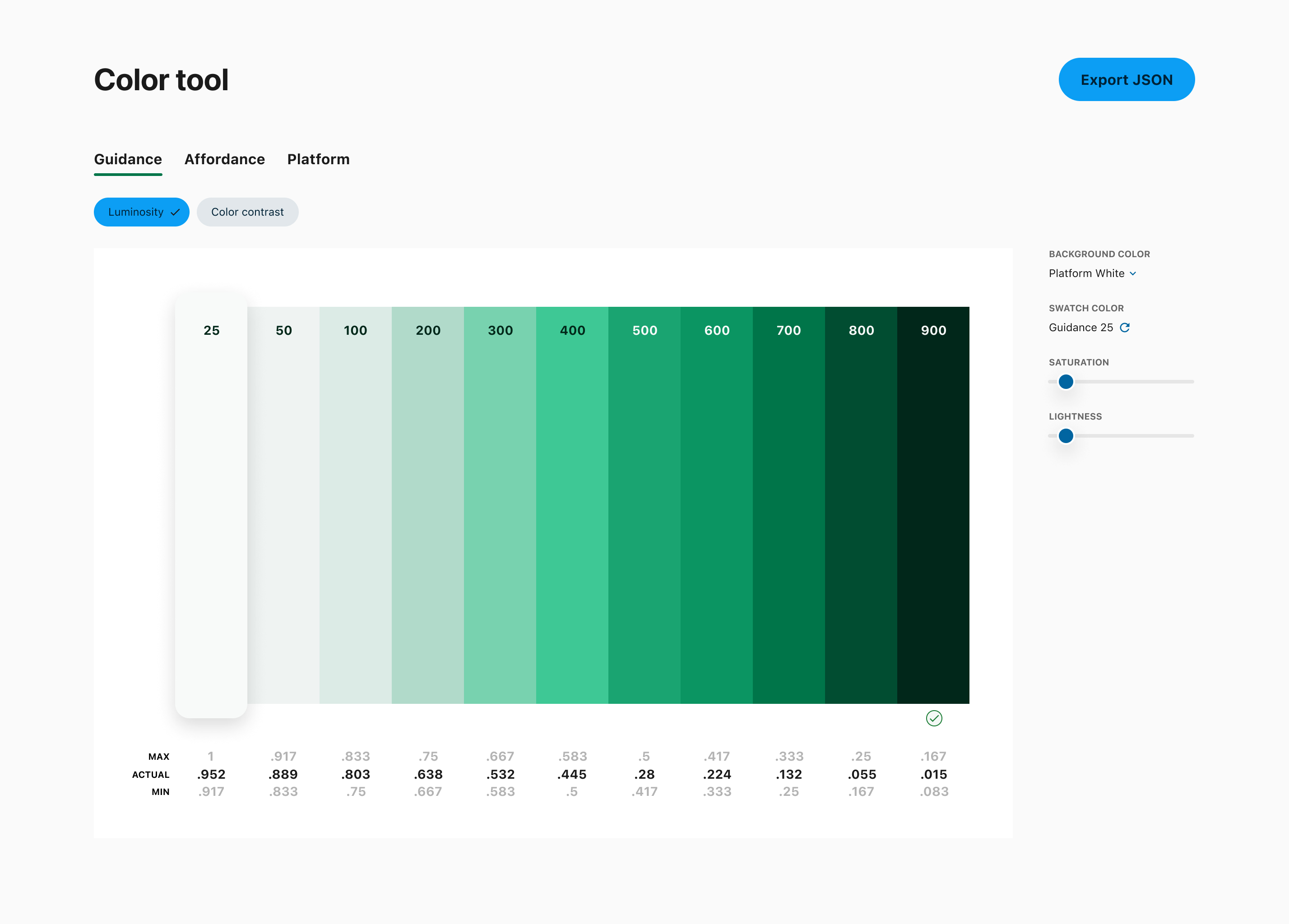
Automation handles the hard constraints, but clients still needed the ability to express their brand within the system. UI sliders let a user adjust saturation or lightness at each ramp step independently — but each step has a luminosity floor and ceiling calculated from the ramp logic. No matter what the sliders do, the step can't leave its predefined luminosity band. The system stays intact.
Output
Once the ramp is configured, the system exports a JSON object of design tokens — key-value pairs for every color step across every role (primary, secondary, error, success, warning, info, and their on colors). Engineers reference the JSON at runtime; update the token file and the entire product re-themes automatically.
This was the same token pipeline the design system already used — the color system just automated the generation of the values that previously required manual designer input.
Outcome
The dynamic color system eliminated bespoke theming as a bottleneck for new client onboarding. What previously required a custom design project now required a brand hex and a few minutes with the slider UI. Accessibility compliance was built into the output rather than audited after the fact.
It also fed directly into the second-generation design system's token architecture — semantic color roles (affordance, guidance, messaging) could now be reliably generated for any client brand rather than being hardcoded per implementation.